This is the final blog of the semester, where has all the time gone. Now since it is almost Christmas and most people will be writing a Christmas related blog, as a maverick I have decided not to indulge in such practises. Instead I am going to bring your attention to a video that my housemates showed to me last week.
The Victoria Secrets Fashion Show (2012), a mind-blowing experience I urge you all to watch it especially the males reading this blog. The best-looking women in the world barley clothed and music need I sell it anymore?
Now does this have anything to do with my blog? No, I thought it just needed to be brought to people’s attentions so I hope you enjoy. This week’s blog will branch out on last weeks blog on fair trade. The other day I was coming back from the maclab (my second home essentially) and popped into Aldi. At the checkout I saw some malteasers and decided to have a quick look at the packet.
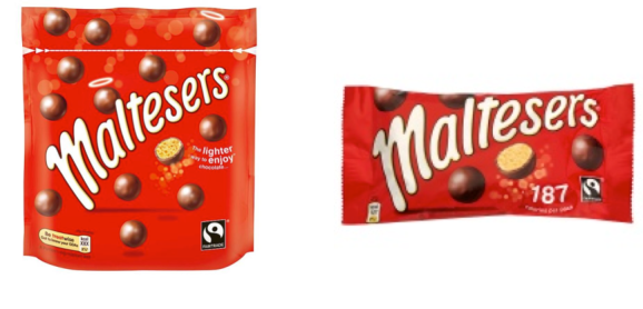
At first I did not notice that this product now contains a fair trade mark on it. Why? Well 1) the logo is tiny and 2) when I picked up the packet my finger covered the logo. So is this really the most logical place to put this logo? People always have good intentions despite their ethical intentions; people rarely buy ethical products ethical products (Auger and Devinney 2007). This could partly be due to a lack of knowledge about buying ethically (Vyth et al 2009), could be that people just do not want to purchase ethically, or maybe products are just not making consumers aware of the fair trade standards. This comes as a surprise to me because people do have good intentions to purchase these types of products (reference), however only a small logo is applied to the packet. Consumers often purchase products with the logo’s unintentionally (Vyth, Steenhuis, Mallant et al. 2009)
People tend to look first in the centre, then to the left, then to the right (reference). If this is true for eye tracking on products then the fair trade logo is blatantly in the wrong place. The right side has been stipulated to be the last place a person will look, if this is true then the fair trade logo will be something that is least payed attention to, so why is it there? It seems ridiculous that such an important logo has not been made more obvious on packaging.
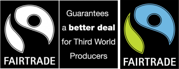
A further problem I have noticed is that the colour of the fair trade logo seems to have changed from what I remember it as. It seems that the logo is now devoid of any colour, and is now made up of just black and white colouring. Though I believe that neither of the logos possess much potential to jump out the packaging a bit of colour always goes far. Colour is an integral part of any logo (Madden, Hewitt, & Roth 2000) it really can help people notice and make things stand out. So this change to a rather bland logo makes no sense to me.
I realise that there is sometimes a price difference between fair trade products and non fair trade products, which stops consumers from buying fair trade products, however this difference is not evident in chocolate products really. As stated before people do tend to have good intentions to buy ethically however if the fair trade logo is left in a redundant place and left so small then this will not be effective on chocolate packaging. Do you think there could be more done to make sure that these logos are more recognizable? Or are the logos sufficient enough in your opinions?
Reference
Madden, T. J., Hewitt, K. & Roth, M. S. (2000), “Managing images in different
cultures: a cross-national study of color meanings and preferences”, Journal of
International Marketing, 8(4), pp. 90–107

Interesting blog topic! Research has found that on the whole, ethical consumers who buy fairly traded goods are on the whole, insensitive to price differences between that and normal goods (Arnot et al., 2006). This obviously poses a problem as consumers who are already purchasing ethically don’t care about price, whereas other consumers without these inclinations are more price sensitive. This suggests that there obviously is a big difference in the mind-set of ethical and non-ethical consumers.
http://onlinelibrary.wiley.com/doi/10.1111/j.1744-7976.2006.00066.x/full
I never tend to notice whether chocolate and confectionary are fairtrade or not – it’s not what I look for when purchasing a product. It’s not that I don’t care about fairtrade… it’s probably more to do with the fact that it is hard to see those tiny logos, and so I tend to presume that most stuff is fairtrade. I think it should be the standard that food is sourced fairly.
I suppose also there is a value-action gap when it comes to what people think of the importance of fairtrade and whether they explicitly buy only fairtrade products. Perhaps people would be more inclined to deliberately purchase only fairtrade food if the logo was made much more clear on the packaging.
Did not know that mars did fairtrade products…..perhaps fairtrade is beginning to become more and more mainstream so consumers are beginning to expect fairtrade as mentioned above….Maltesers don’t play on the fairtrade side of things in the advertisements …just that they are a (supposedly) lower calorie chocolate choice. Maybe now consumers tend to focus more on health and calories than fairtrade since fair trade is usually correlated with a higher price. This may make consumers expect the product to be higher priced if it is fair trade and then avoid the products and thus Mars has chose to avoid promoting the fact it is fair trade.
I see what you mean about the fairtrade logo being so small, I definitely wouldn’t notice it straight away. However, maybe that’s not important. It’s fairly noticeable if you’re looking for it, and customers who actively seek ethical products would presumably be looking for it. Otherwise, people aren’t all that interested, and don’t need to see it. In fact, research suggests that those people who aren’t interested in ethical consumption think that ethical products are less functionally efficient (Luchs, Naylor, Irwin & Raghunathan, 2007). So perhaps the logo is kept so small to make sure ethical consumers can still spot it, but that non-ethical consumers aren’t affected by it!
Nice blog!
I think psub06 and brandforlife have made a really important point about this packaging – people only usually notice fairtrade logos when they’re actively looking for them! And so perhaps Mars believed a large logo would detract from their standard logo; Pimental and Heckler (2003) showed that a change in logo could have a strong negative impact on consumer opinion of a product. So as brandforlife pointed out, it is likely that Mars are getting the best of both worlds with their logo strategy!
Hi there!
I found your blog very interesting to read as I am interested in fair trade campaigns.
Research has identified that it is often personal values that dictate whether we become ‘ethical consumers’ or not (Rohan, 2000). Essentially, it is our values that predict our behaviours – even in the consumer world (Blackwell et al., 2001). This means that ethical consumers are motivated (by their values) to seek out fair trade products – the fair trade industry simply marks the products for easy targeting by this population (Doran, 2008).
However, I completely agree with your points regarding the advertising of fair trade – it has not been adapted to attract new consumers (converting unethical to ethical habits). If the fair trade campaigns were to create adverts promoting awareness, to create signs in supermarkets and to upgrade their logo – I feel that previously unethical consumers may jump onboard!
Hi there, this is a great blog topic and made me really think about logos on packaging.
I wonder why we look in the bottom right corner last? Is it perhaps because a large percentage of people are right-handed, so naturally, this is where we would hold the packaging? To add to this, as I am sat here looking at the logos on everything, most products have logos and important information in the bottom right hand corner. Dan Hill termed this corner the ‘Corner of Death’, so why do we see so much happening here?! Janiszewski (1990) concluded that the position on the logo on the product does have an impact on sales. Janiszewski (1993) reported that the position of the logo or brand name on the product will not matter if the consumer already favorites the brand. Combining a few of the above comments, maybe this is why there is no need to put the fair-trade logo in a more prominent place; those who like maltesers will buy irrespective of fair-trade logos and those who want fair-trade chocolate will go looking for the brand.